The challenge
Make the next step easy to understand.
The existing interface was difficult to navigate. Users needed a clearer way to find information, manage charging and understand what was happening in the app at a glance.
 Let's talk
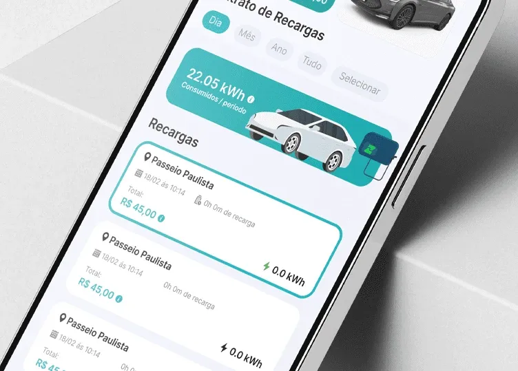
A clearer charging app for electric mobility, with intuitive navigation and useful visual feedback.
Project at a glance
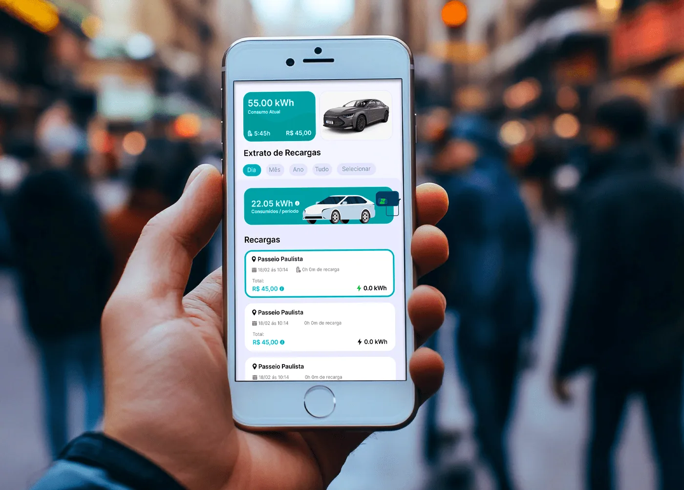
Make the next step easy to understand.
The existing interface was difficult to navigate. Users needed a clearer way to find information, manage charging and understand what was happening in the app at a glance.
Give every interaction a clear purpose.
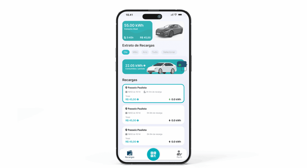
We simplified the flows and made the visual hierarchy easier to follow. Interactive elements and smooth animations support the experience, while a charger icon changes color to communicate charging status immediately.
What we delivered
We partnered with ZuuZ Mobilidade Elétrica to redesign its charging app. The goal was to turn a difficult interface into a modern, streamlined experience that makes everyday charging information easy to understand.
The result
Charging information is easier to understand at a glance.
Color and motion help explain the current charging status.
Simpler flows make the app more approachable to use.
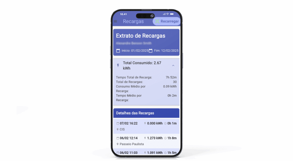
Before & after
A clearer visual hierarchy and more approachable experience.
Gallery
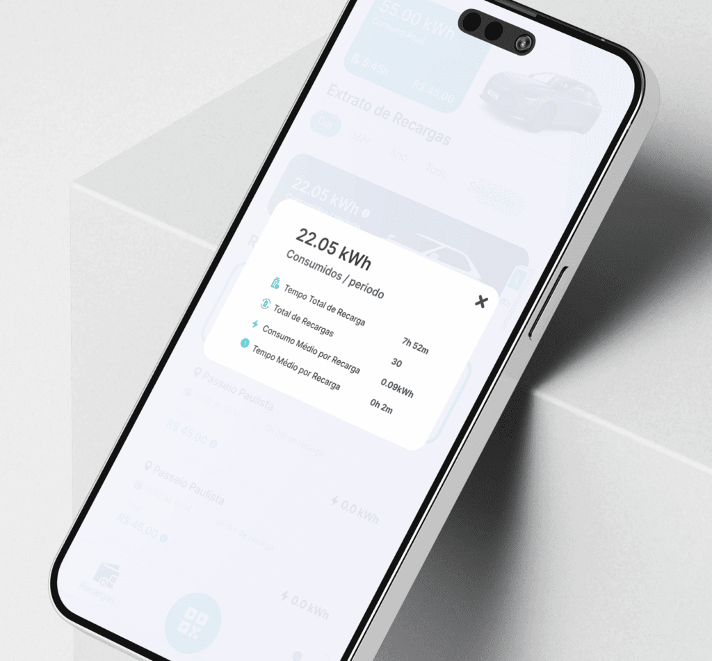
A closer look at the finished work and the places it comes to life.
Similar projects
 Website design
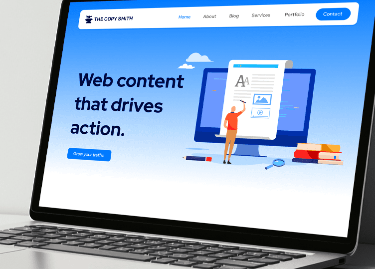
A clear, approachable website that balances a copywriter’s professionalism with personality.
 Event identity
One event identity, carried through every detail of All Raise’s A Cut Above summit.
 Brand identity
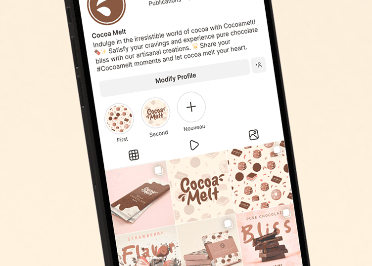
A playful, indulgent identity for an artisanal chocolate brand, from its logo to the wrapper.
Let’s collaborate
Tell us what you’re working towards. We’ll reply within 24 hours with a clear plan and an upfront price.